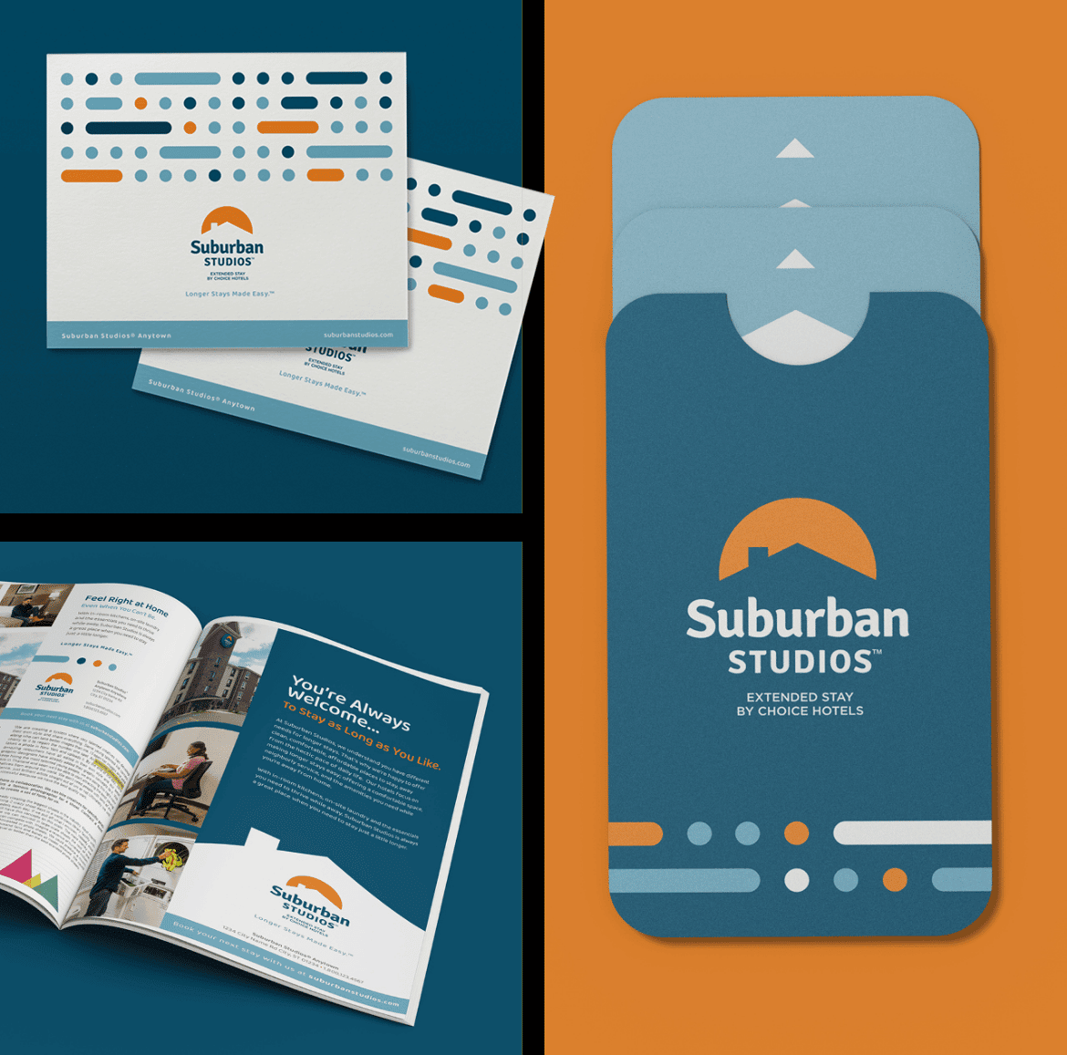
As one Choice Hotel International’s legacy brands, Suburban Studios faced increasing competition in an ever-growing category of extended stay, and they wanted to retain their consumer recognition and effectively set consumer expectations. NM+U realized that highlighting Suburban Studios’ neighborhood-friendly nature, communicating their value proposition of offering ‘just the essentials’ of what you need for extended stay without overpromising, and retaining the iconic roofline branding while differentiating itself from the competition would be key.
Suburban Studios by Choice Hotels
Suburban Studios, part of Choice Hotel International, is an economy brand with over 70 locations across the United States. As the brand began its 2021 growth and expansion plan, they created new prototypes and updated brand plans. To help them with this growth, they needed to recreate the brand’s look and feel, and value proposition to help them with these efforts.

Challenge
Solution
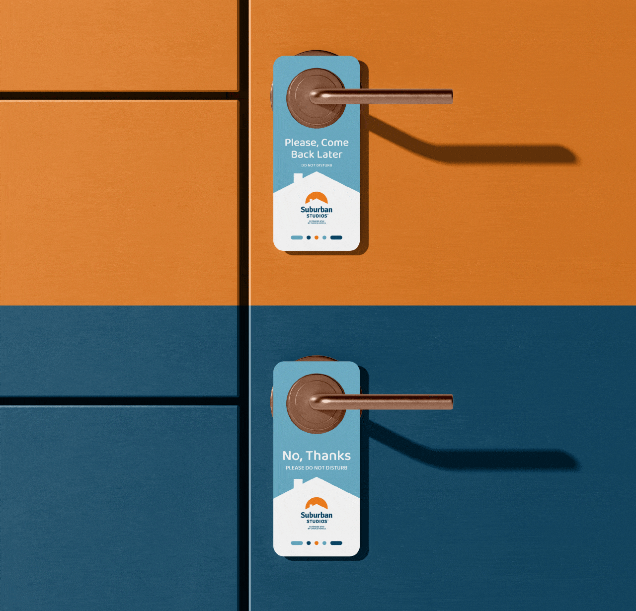
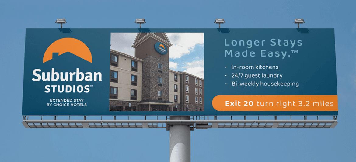
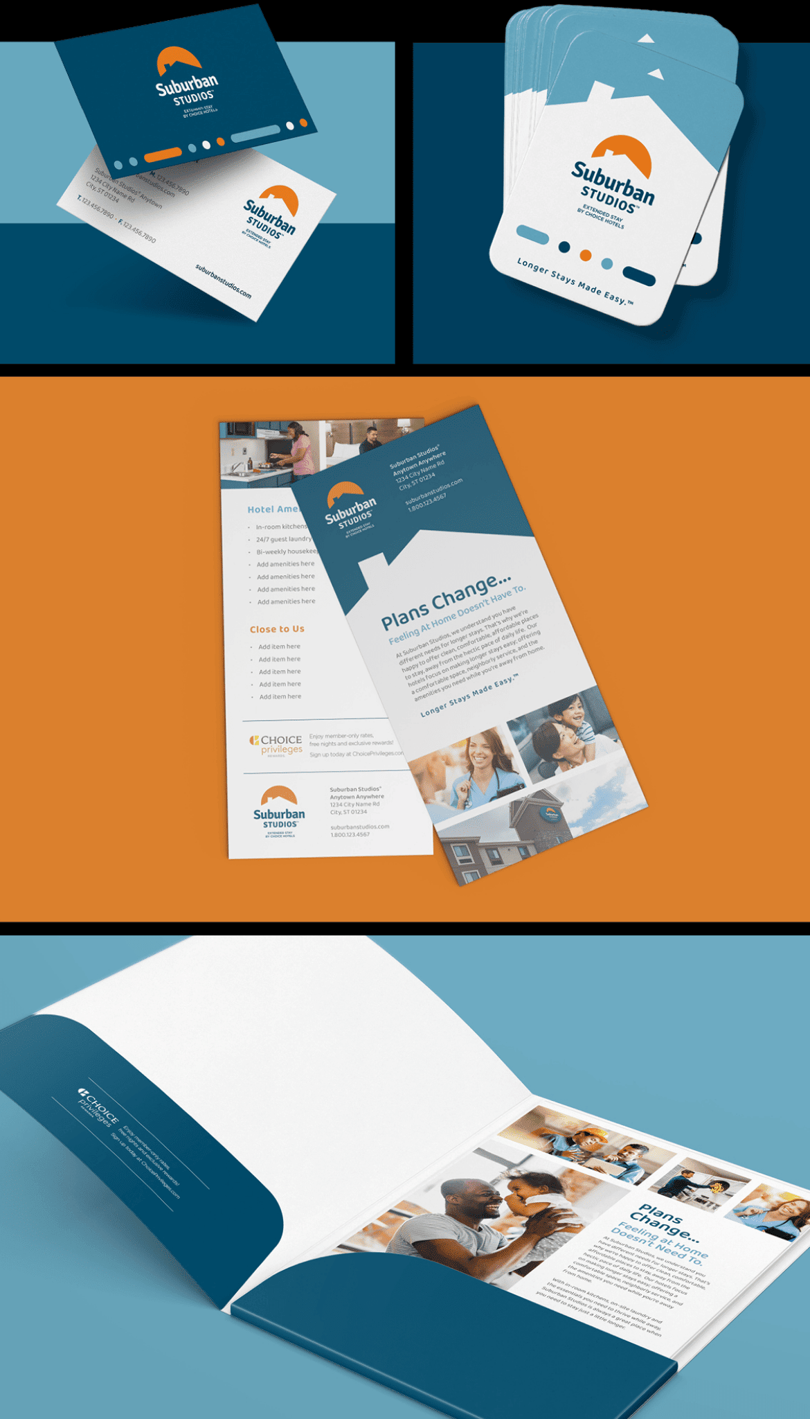
By creating a minimalist silhouette of the roofline and accentuation the sunrise/sunset motif, NM+U set the tone that suburban is a safe, secure, and comfortable roof over your head, morning, noon, and night. The typography is stylized without hard edges to portray the friendly neighborhood vibe of the hotel. The color palette is simple, yet bright: representing the welcoming atmosphere that can be expected. The lines and dot patterns are symbolic of weeks and days on a calendar being marked off for the amount of time a guest might spend during their long-term stay. All-in-all, Suburban Studios now stands for ‘longer stays, made easy.’
