Sleep Inn Brand Development
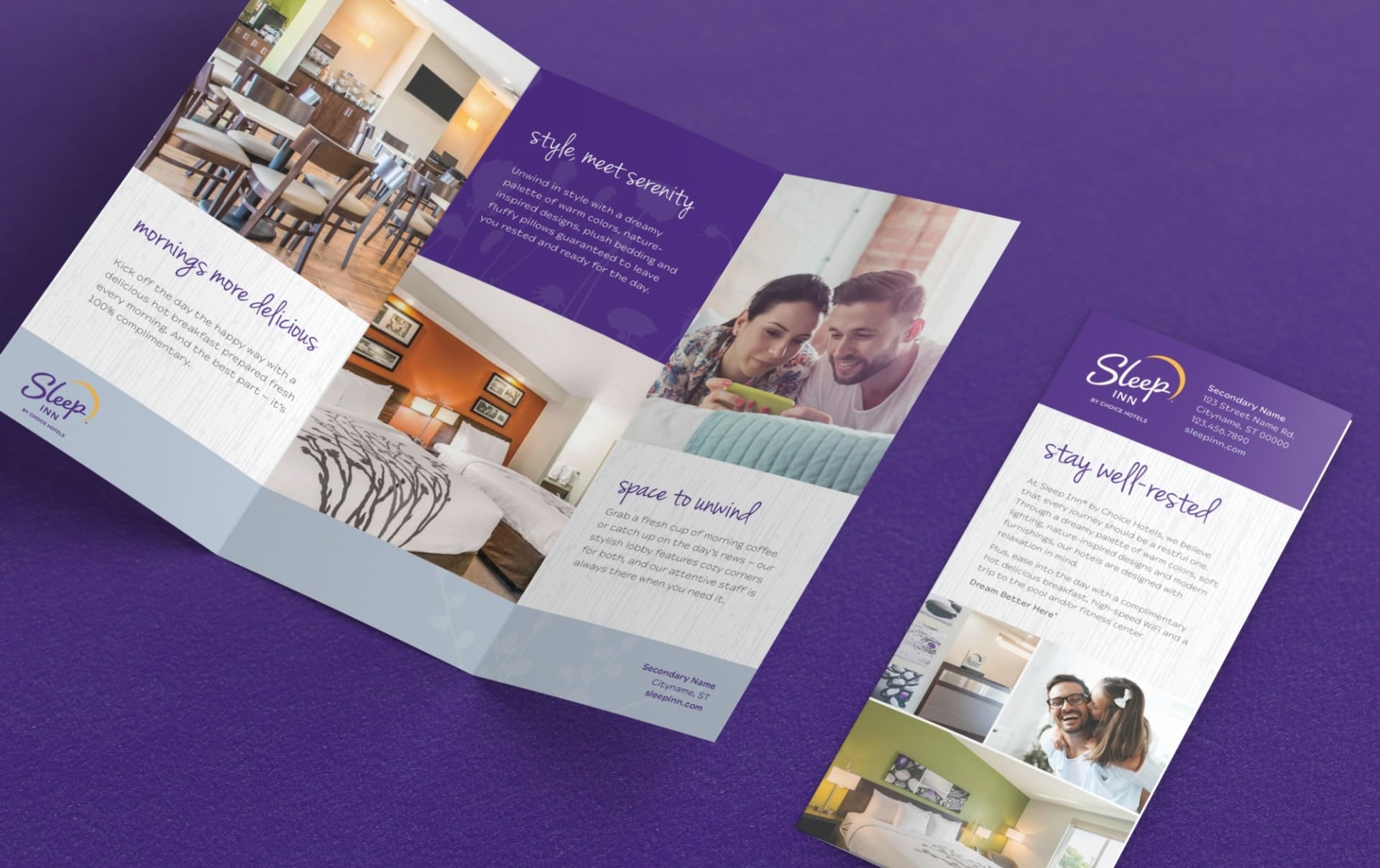
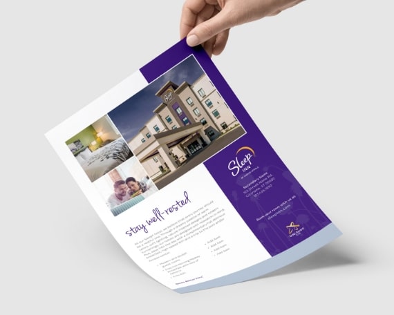
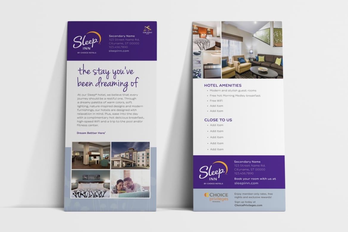
Sleep Inn required a new brand identity and refresh to leverage its value proposition as a new-build hard spec brand. They wanted to ensure their new identity worked in various applications, from exterior signage to on-building wall applications and small format digital and print.
Challenge
NM+U had to create a fresh brand identity that remained true to the brand’s existing nature-inspired zen feel while also bringing the brand into a more modern space. Sleep Inn also wanted to keep purple and yellow colors to retain brand recognition.
Solution
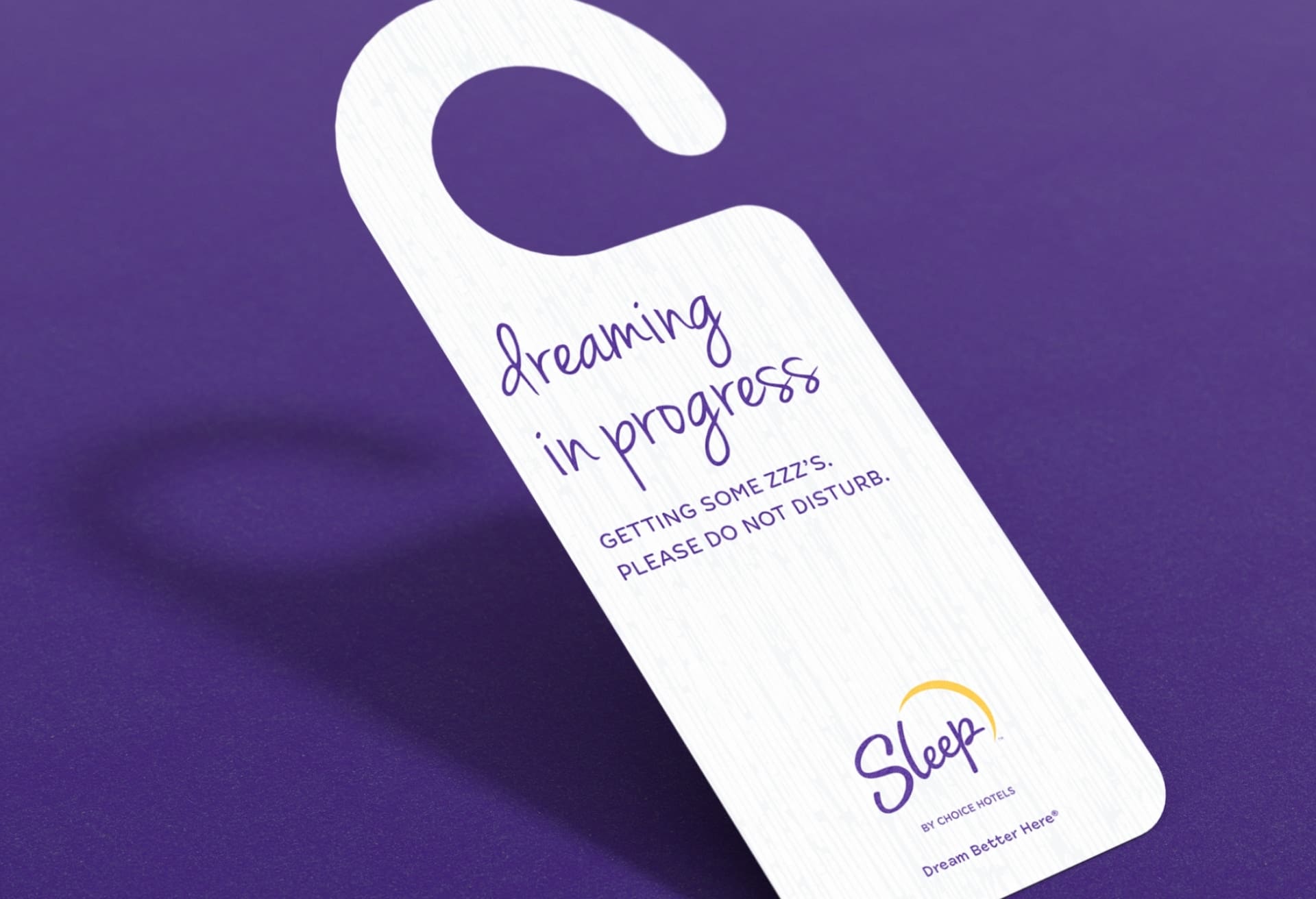
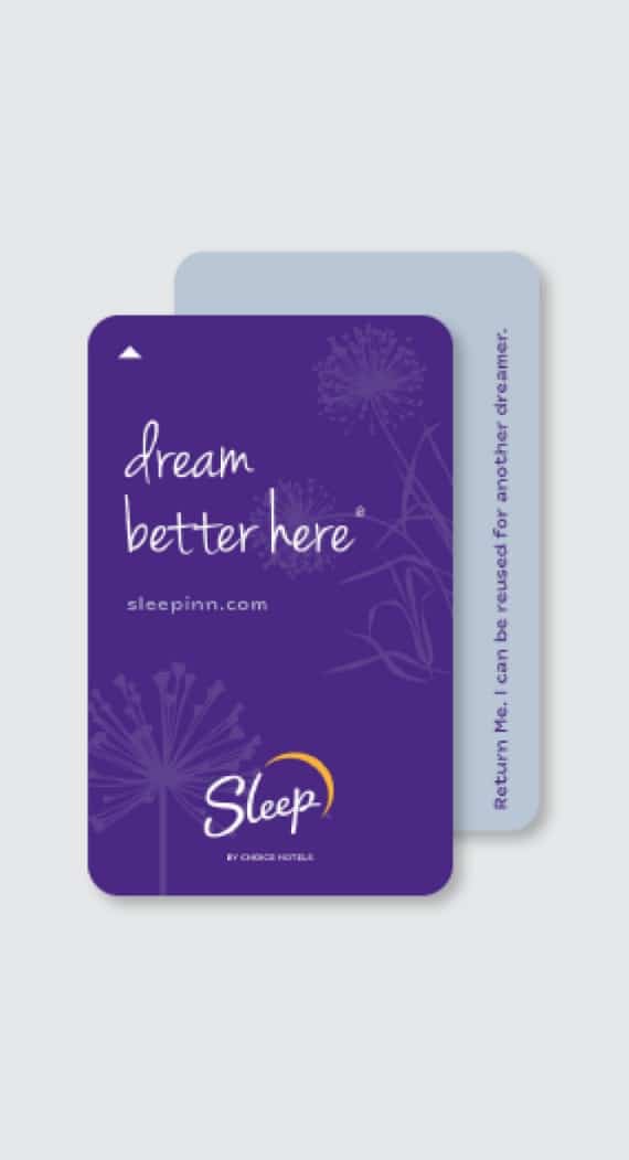
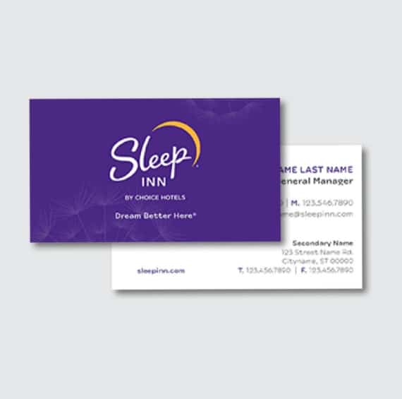
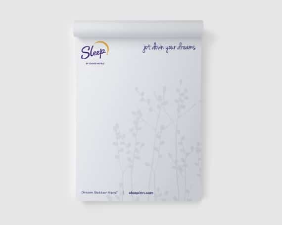
The team produced a refreshed color palette and a balance of clean, modern elements with organic shapes to appeal to travelers seeking a restful night’s sleep. The invigorated themes and elements would play out through all communications and collateral for a cohesive and strong new look. Sleep Inn’s new logo preserved the yellow moon concept but introduced a hand-drawn type for the word “Sleep.” The nature graphics and colors were essential to the updated creative development, living cohesively with the existing on-property interior design.

The logo
Sleep Inn’s new logo is an inspired update to their previous, keeping the concept of the yellow moon and introducing a hand drawn type for the word “Sleep”. Nature graphics and colors were an important aspect of the updated design so that it lives cohesively with the existing on-property interior design.
