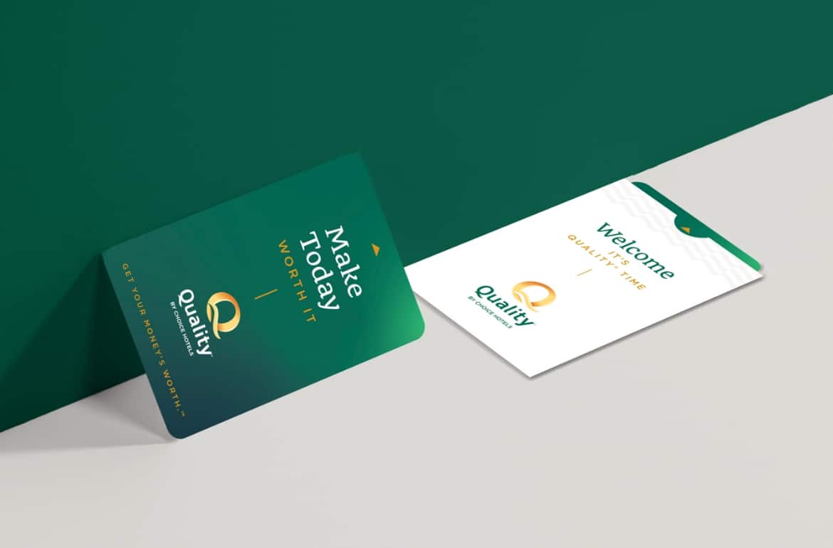
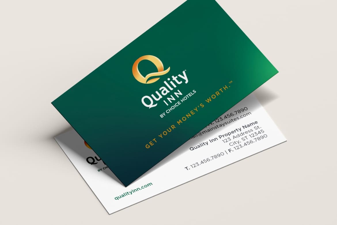
With over 2000 hotels in the continental United States, the Quality Inn brand is an icon that is seen by 100s of thousands of consumers in transit daily. While the logo had not previously been updated since the mid-2000s and needed a refresh, it was important to not stray far from its core look and feel to not damage that built up recall. The challenge was to leverage the brand’s colors and “Q” icon, but to bring it out of it’s former holding space to prepare it for the more digital world.
Choice Hotels
Quality Inn Brand Identity
NM+U was tasked with creating a new logo and brand identity for "Quality Inn" that leverages specifically Quality's extensive brand awareness and rich brand history.

Challenge
Solution
NM+U leaned into the legacy green, and added several other warm variations in the form of a multipoint gradient to create more depth and polish. The modern gradient fits well in a more digital environment and at the same time adds a tactile feel to printed pieces that enhance the feel of either the simplest collateral. A unique combination of fonts bring contemporary and traditional together, bridging the space between what was and what will be. Simple, clean and modern was the goal here; just like the Quality Inn’s themselves.


