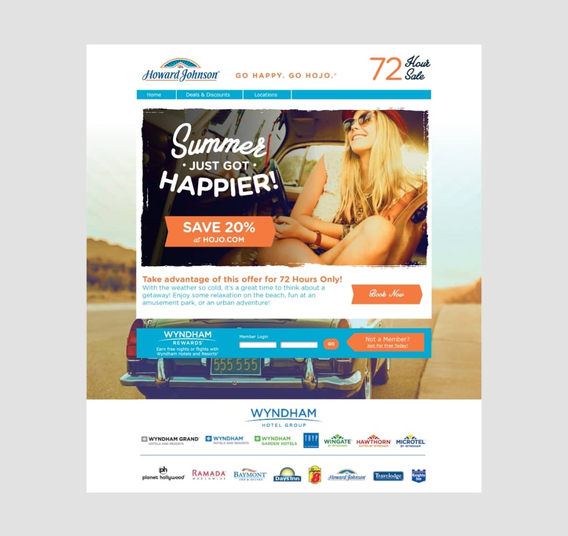
Howard Johnson Hotels Brand Refresh
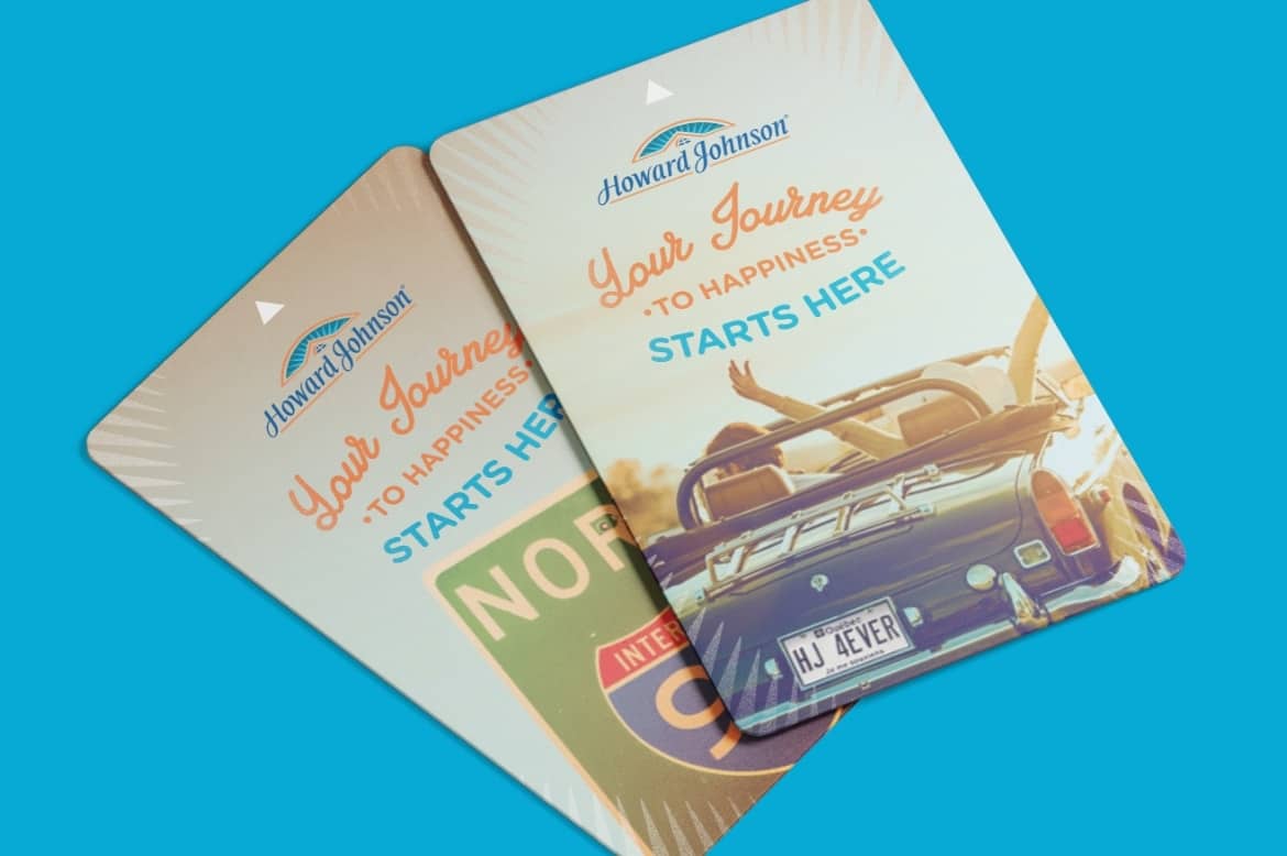
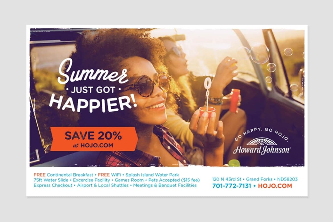
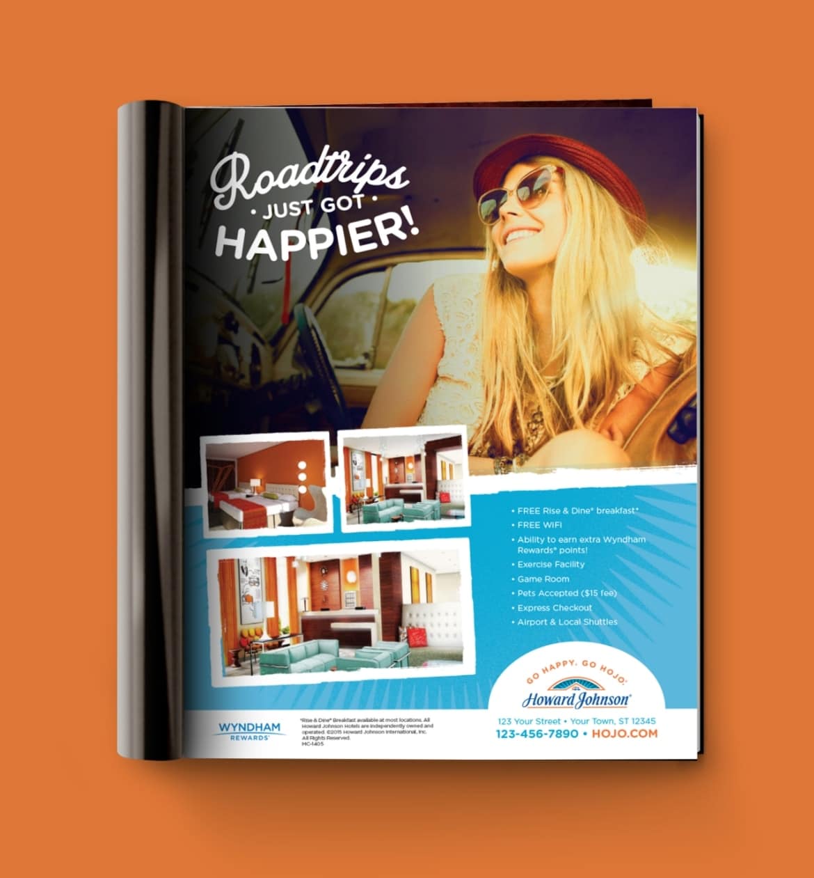
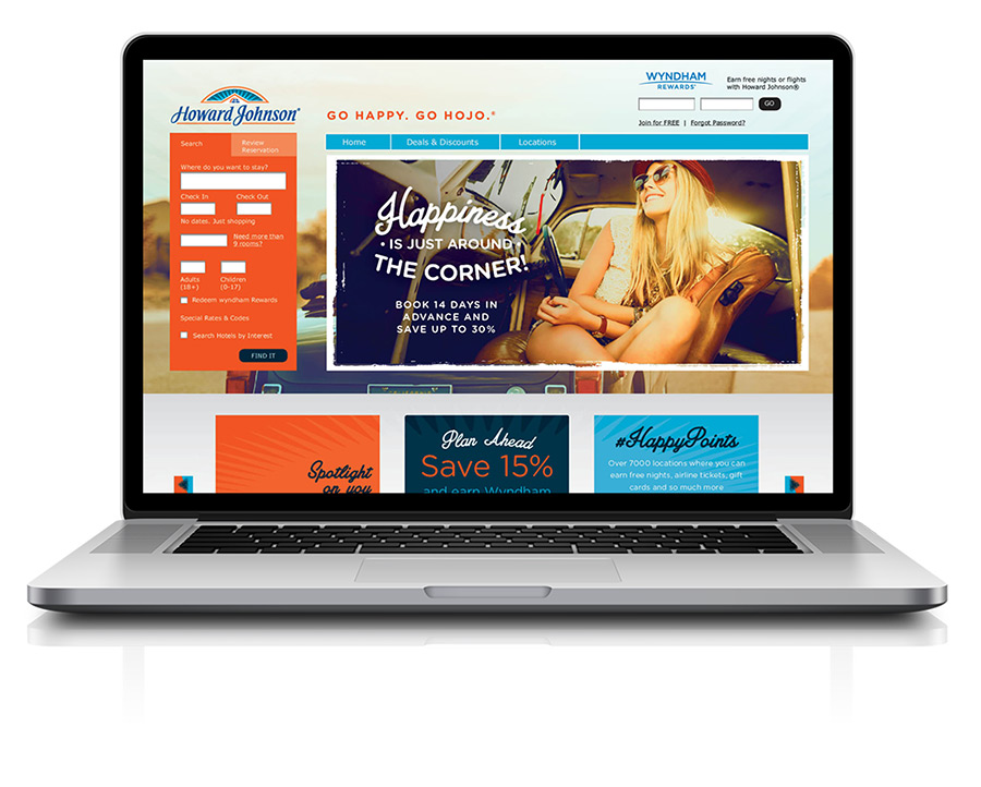
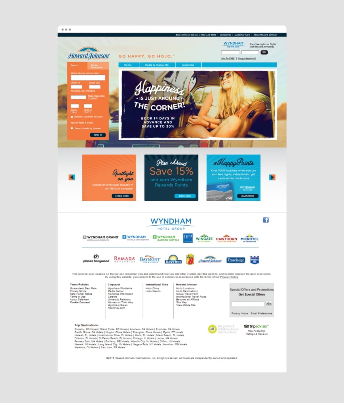
Howard Johnson, an established economy hotel chain with over 400 properties around the world, tapped nm+u to undertake a comprehensive visual refresh to better align its “Happy” positioning with its original roots and heritage as a roadside hotel brand while elevating the overall sophistication of the brand.

Challenge
The agency conducted a comprehensive discovery exercise to identify key elements from Howard Johnson’s heritage and value proposition as well as opportunities for differentiation within the competitive set.
Solution
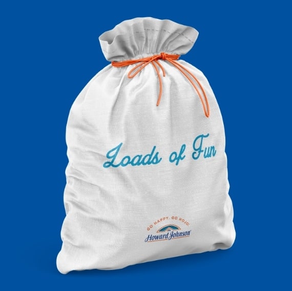
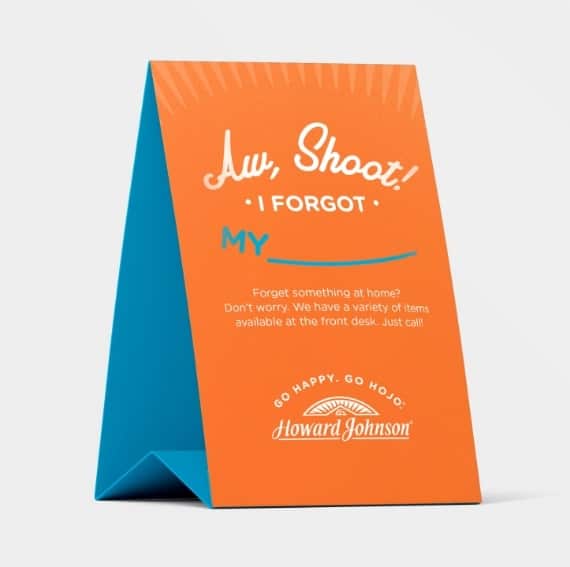
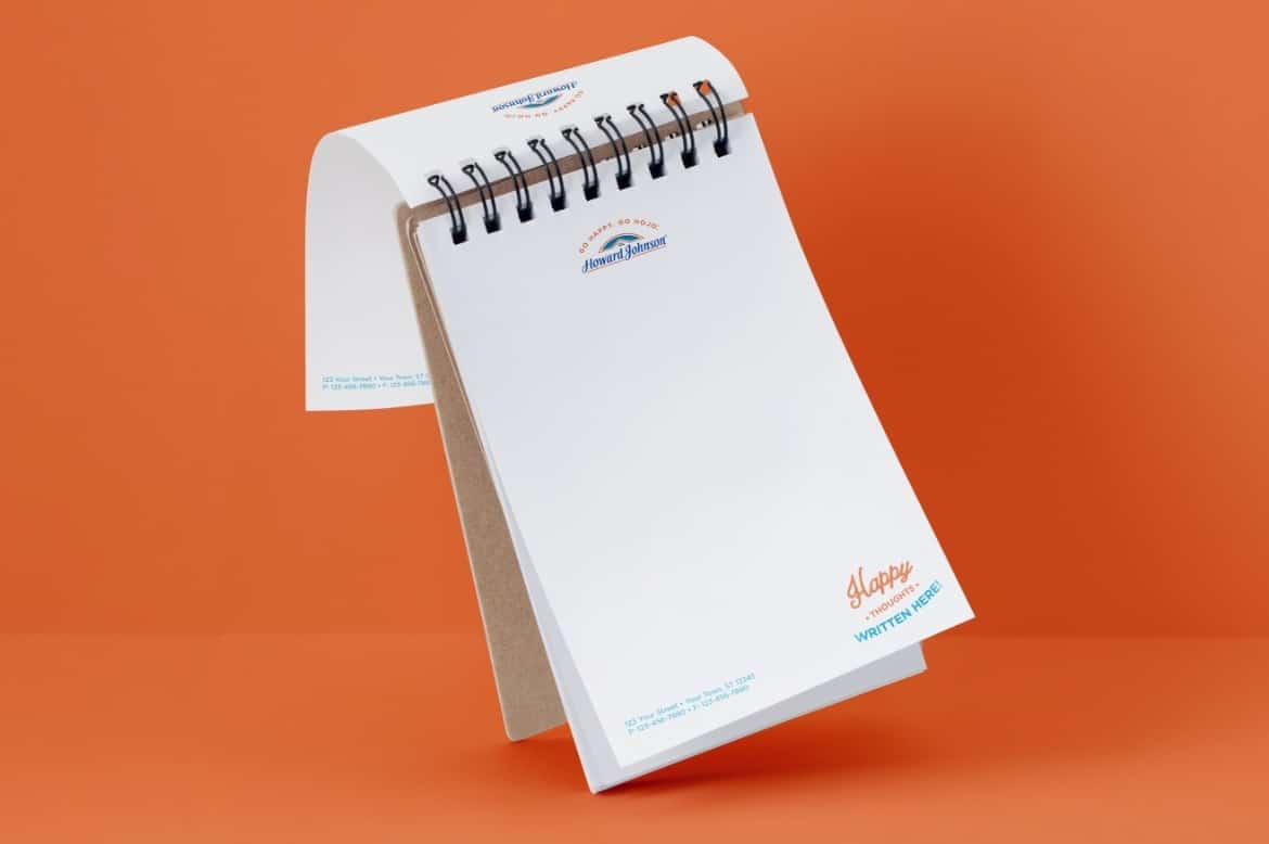
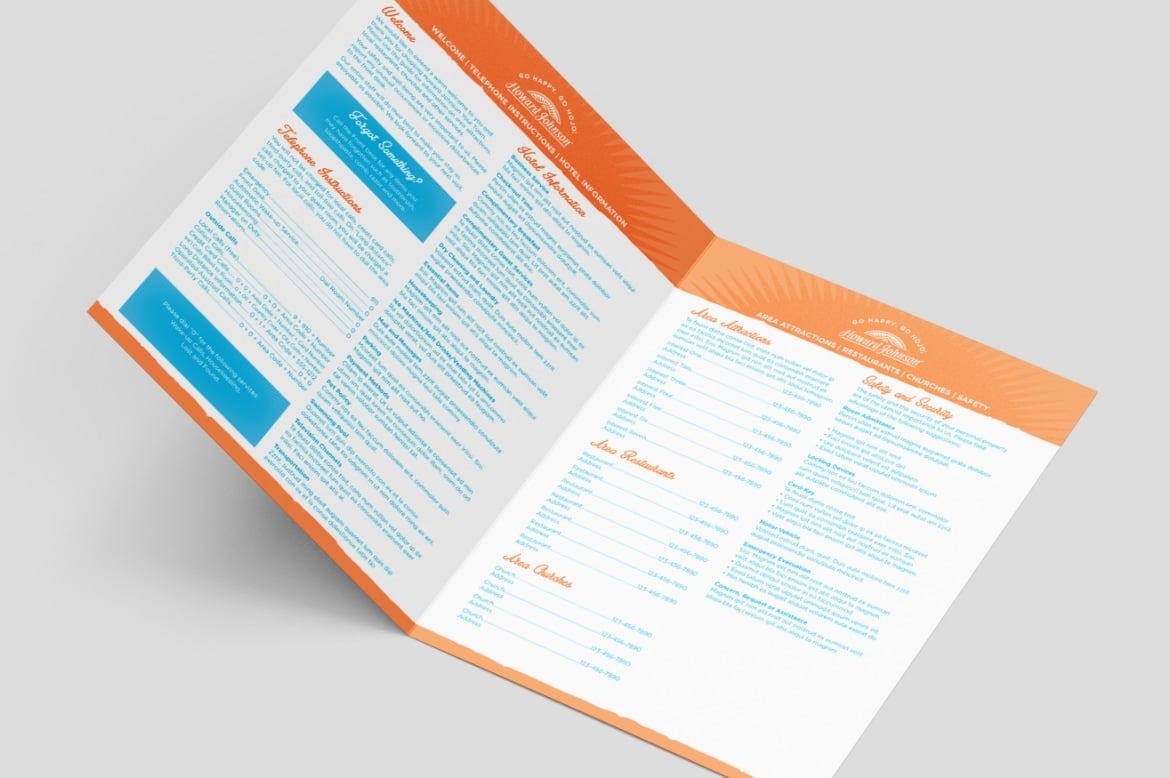
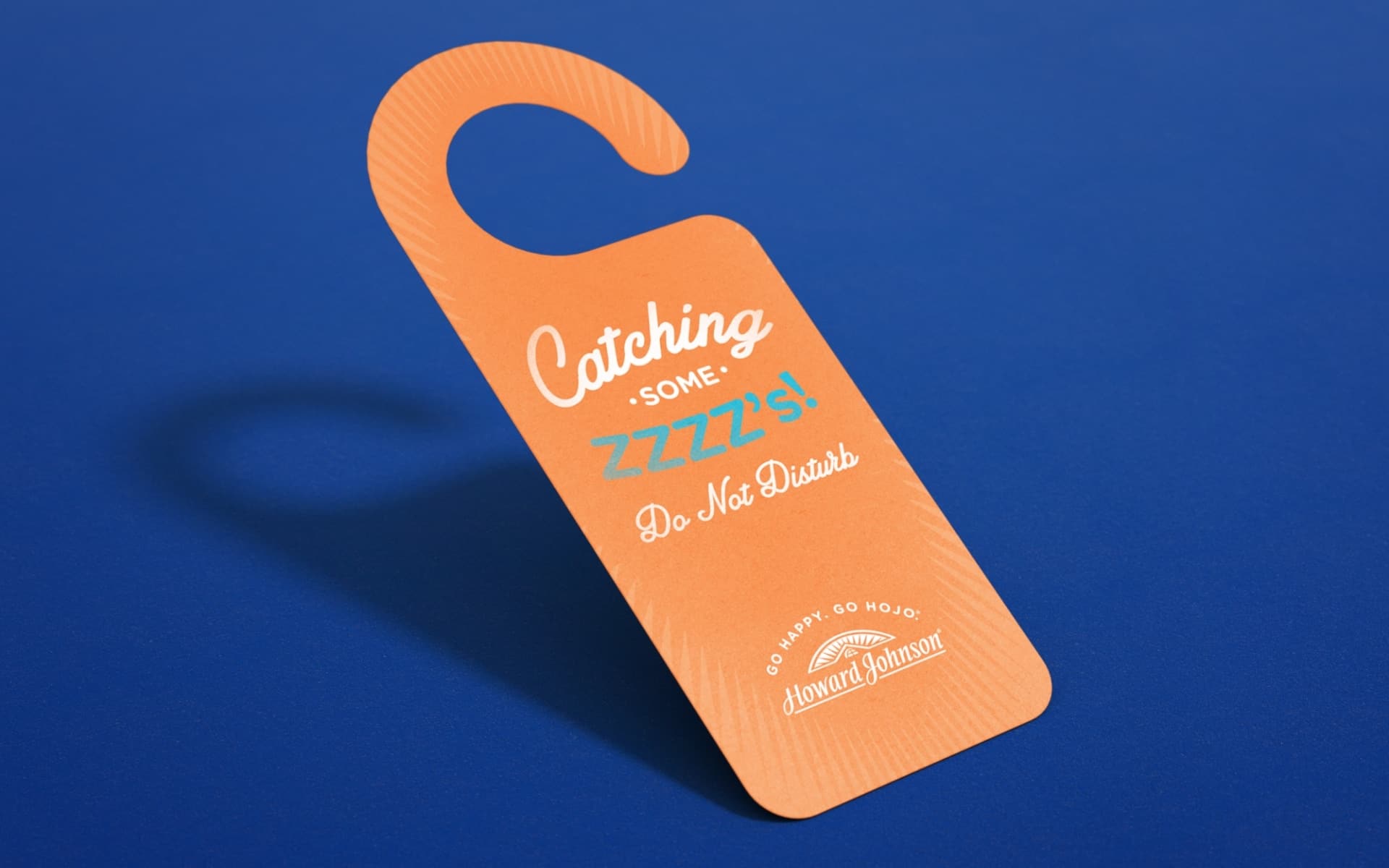
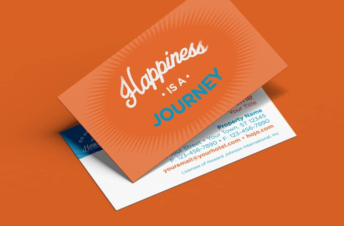
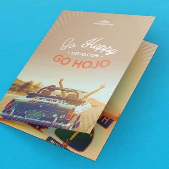
The new Howard Johnson brand feels true to itself, is contemporary and sophisticated while still appealing to the road traveler. The brand’s blue and orange color palette was leveraged in order to maintain the “happy” attribute of its positioning. A unique visual style was developed using elements that pay homage to the brand heritage.
