Better Homes & Gardens Real Estate
Real Estate Talent Attraction Website
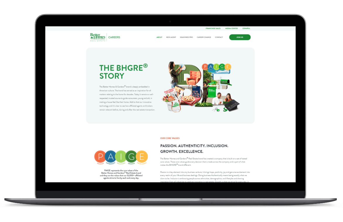
Better Homes and Gardens Real Estate was in need of a talent attraction website to leverage the new BE BETTER campaign. It needed to be bright, airy, colorful, and full of information illustrating the benefits of joining the BHGRE brand.
Challenge
With a heavy amount of information and a B2B focus, the challenge was to make the site commercially and visually effective in representing the brand campaign and positioning.
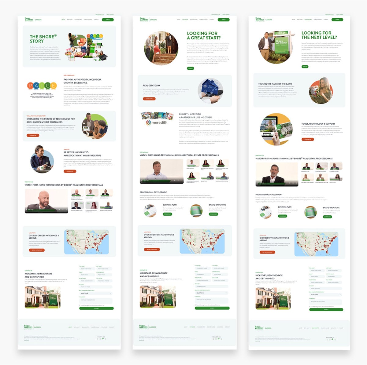
Solution
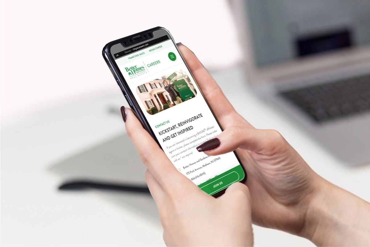
NM+U relied heavily on UX and UI best practices while laying out a rock-solid site map and wireframe. This resulted in a site containing a plethora of details that were easy to navigate without being overwhelming. It’s easy to use on mobile, tablet, and desktop while communicating all it needs to.


